Data Manipulation
그래프 영역 설정
- fig, ax = plt.subplots(figsize=(5,6))
seaborn.rugplot()
- rugplot : x,y축 위에 작은 rug로 실제 데이터들의 위치 보여줌
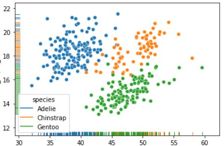
seaborn.stripplot()
- jitter = True : 점들이 겹치는 현상 해결
그래프 색상 지정
Ex)
palette = {"Adelie":'#ff9ff3', "Gentoo":"#4000c7", "Chinstrap":'#1dd1a1'}
- 이미지 안에서 색상 코드 찾기
- palette 참조용 레퍼런스
seaborn.FaceGrid()
- FacetGrid(data, row, col, hue) : 다중 플롯 그리드를 만들어서 여러가지 쌍 관계를 표현하기 위한 그리드 Class이다.
Ex1)

g = sns.FacetGrid(iris, col='species', hue='species')

g.map(plt.hist, 'sepal_length')


Ex2)

sns.boxplot(x = 'time', y = 'tip', data = tips, hue = 'time', palette = {"Dinner": '#ff9ff3', "Lunch": '#1dd1a1'})
BI Tool
- Tableau

- Data Studio (Google)

위 두개는 실무에서 가장 많이 사용하는 시각화 Tool 이라고 하니 둘중 하나 공부해두기
사용 목적에 따른 시각화 예시
- 분포 : Pie, Dount, Treemap, Stacked bar
- 관계 : Scatter, Bubble, Hist - Bar
- 비교 : Heatmap, Parallel coordinates, Chernoff face
- 시간 : Line, Connected Scatter
- 공간 : Map
- 불확실성 : Error bar, Confidence band
https://github.com/ft-interactive/chart-doctor/tree/master/visual-vocabulary
(시각화 예시 참고)
dining-developer.tistory.com/30
(시각화 예시 참고2)
(갤러리 참고)
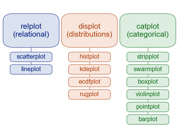
데이터 유형에 따른 plot
레이블 및 주석(Label and Annotation)
# Label

plt.set_xlabel('text', weight = 'bold'(굵게), fontsize = 10)


# Annotation

ax.text(0, 0, 'TEXT 0, 0')ax.text(0, 1, 'TEXT 0, 1')

시각화는 실무에서도 정말 중요할듯 하니 깊게 공부해야 할 것 같다.
결국 사람들이 원하는 건 결과니까 결과를 얼마나 보기 쉽게 표현하느냐가 시각화의 가장 중요한 목표인 듯
코드스테이츠 AI 부트캠프를 시작하고 깨달은 것
1. Computer는 잘못 없고 그냥 내가 오타 친거다.
2. 구글에 검색하면 다 나온다. 영어 공부 Good!
3. 역시 인생은 이론보단 실전
4. 동기분들이 질문에 매우 친절히 대답해주신다. 나도 아는 것이 있으면 친절히 답변하도록
'[CodesSates] AI 부트캠프' 카테고리의 다른 글
| Hypothesis Test (0) | 2021.03.14 |
|---|---|
| Hypothesis Test (0) | 2021.03.14 |
| Data Manipulation (0) | 2021.03.09 |
| Feature Engineering (0) | 2021.03.05 |
| EDA (0) | 2021.03.04 |